Visualizing Data
Introduction
Visualizing is one of RStudio’s greatest strengths, allowing you to create highly detailed plots that can communicate any work in a short amount of time. In this guide, we will provide the basics of data visualization in RStudio and provide an indepth look at using ggplot to plot data.
Base R Plotting
R provides the ability to make quick and simple plots to display your data.
Plotting in r is based around the plot command and vectors or data frames
for plotting vectors, we need to use the plot command, and provide x and y values
plot(x = c(1,2,3,4,5,6,7,8), y = c(10,20,30,40,50,60,70,80))
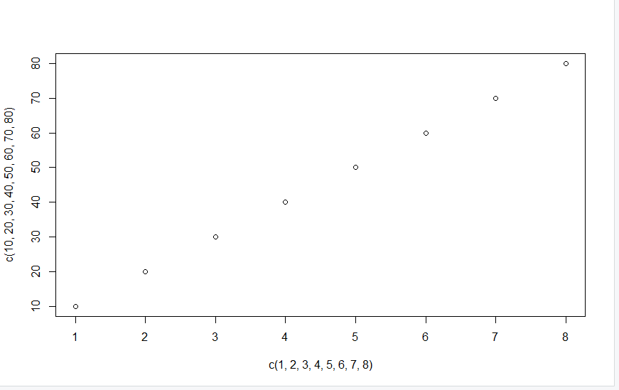
We can also use datasets using our $ specifier from earlier. let’s look at the mtcars dataset for this.
plot(x = mtcars$mpg, y = mtcars$disp)
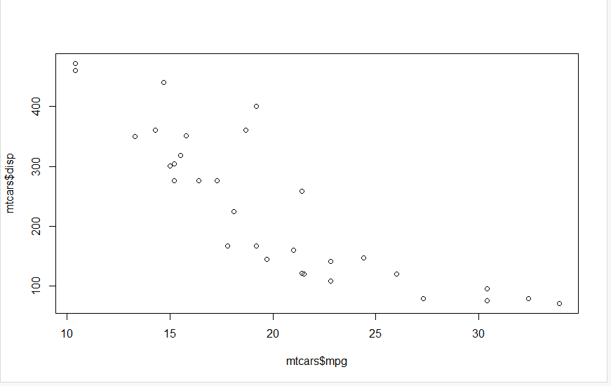
These graphs while displaying our desired information are not very detailed. While there are a suite of options to improve these aesthetics, in most cases ggplot can provide the same and far more options for creating visualizations.
The rest of the guide will go indepth into the quirks of ggplot and the different types of graphs and style options you can have.
Using ggplot
similar to when we used the dplyr package, we want to make sure that we are both installing and calling our package within our script
install.packages("ggplot2")

library(ggplot2)
ggplot syntax
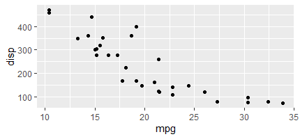
ggplot follows the same mapping process as our base r package, where we either need to provide x and y vectors, or we need to provide a dataframe with our columns of choice. One of the key differences is the structure of our commands. In ggplot, we need to both specify we are calling the ggplot command, as well as the Type of Graph that we are making. Let’s use our mtcars dataset as an example
ggplot(data = mtcars) +
  geom_point(mapping = aes(x = mpg, y = disp))
The graph we are left with from this command is already higher quality then our base r graph.
the section of our command that dictates the type of graph we create is the geom section. R offers a significant amount of geom options. Let’s look at using the geom_line command.
ggplot(data = mtcars) +
  geom_line(mapping = aes(x = mpg, y = disp))
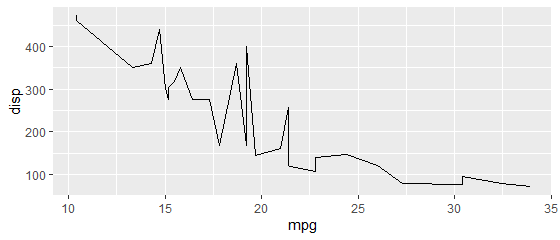
Wow! This graph looks a lot worse…
Every geom that RStudio has types of data they are good at visualizing and some that they are not good at visualzing
Common Geom Types
| Geom Name | Best Purpose | Required Fields |
| geom_point | Highlighting Relationships between two continuous variables | x , y |
| geom_line | Creating lines of best fit | x , y |
| geom_bar | Visualizing counts of different categorical variables | x |
| geom_col | Visualizing categorical relationships | x , y |
| geom_boxplot | Highlighting statistical features of categorical relationships | x , y |
| geom_hline | providing x or y intercepts to a graph | x or y |
| geom_smooth | adding regression lines to your graph | x , y |
Adding Aesthetic Features
Now that we have looked into making a graph, lets explore the ways we can make them visually appealing for our audience.
Modifying our Plotted Values happens both within our aes command an outside of it. Commonly, adding new commands within the aesthetic portion is when we want our aesthetic features and our data to interact in some way. Let’s look at some examples
If we want to change our points to the color red, we can do so by adding a command Outside of our aes() command.
ggplot(data = mtcars) +
  geom_point(mapping = aes(x = mpg, y = disp), color = "red")
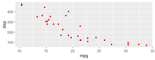
Now, if we want to add colors based on other columns in our data, we would want to add our command Inside our aes() command.
ggplot(data = mtcars) +
  geom_point(mapping = aes(x = mpg, y = disp, color = cyl))
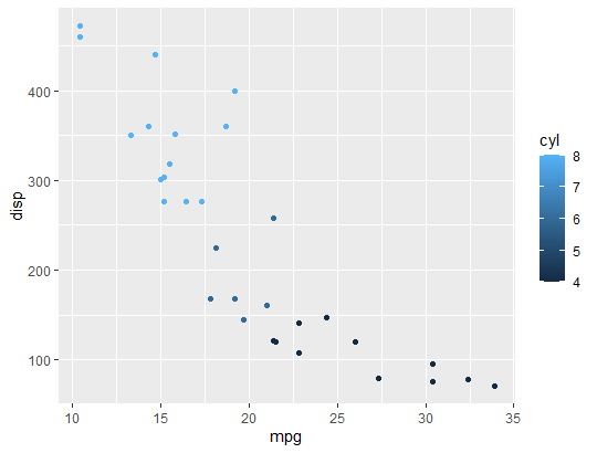
Look at that! With just this small change, we can now add information to our graph that highlights a relationship. We can see that as our cylinders per vehicle increases, our disp goes up, but our mpg goes down. There are some other simple commands that we can use in our data, lets look at an example with size outside of our parenthesis
ggplot(data = mtcars) +
  geom_point(mapping = aes(x = mpg, y = disp,  color = cyl, size = 3))
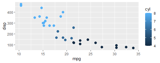
With this command, we have effectively made all of our data easily readable while highlighting our relationship of interest. Finally, let’s make a line of best fit for our data using the geom_smooth command. We can do by adding a Second geom command.
ggplot(data = mtcars) +
  geom_point(mapping = aes(x = mpg, y = disp,color = cyl), size = 3) +
  geom_smooth(method = "lm", aes(x = mpg, y = disp))
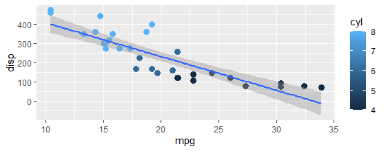
Note: There are many options for changing the aesthetics of your ggplot for every type of geom type. For specific modifications, we recommend that you check out our coding resources as wel as ggplot documentation for more information
Now we have effectively displayed a lot of information! However, its a little messy and for some audiences it can be hard to interpret…
We want our visualizations to be easily understood, our audience of interest should be able to tell exactly what relationships we want to highlight and should be able to easily see it.
let’s look at how we can use our Labels and our Themes to do so!
Using Labels and Themes
Labels and themes are how we communicate what we are visualizing to mass audiences. In RStudio, we can create labels for all factors, and we can use themes to change the appearance of all elements in our plot.
Labels are used in ggplot with the labs command. Common features that we will aim to modify labels for our the X and Y axis, Titles, and our Legend.
Let’s use our graph from earlier and create some labels.
ggplot(data = mtcars) +
  geom_point(mapping = aes(x = mpg, y = disp, size = -cyl, color = cyl)) +
  geom_smooth(method = "lm", aes(x = mpg, y = disp)) +
  labs(x = "Fuel Efficiency",
       y = "Displacement",
       Title = "Fuel Efficiency of Cars based on Speed" ,
       subtitle = "The relationship between fuel efficiency and displacement depends on the cylinder engine",
       color = "Engine cylinders")
       #for our legend, renaming will require us to call the name of the variable which is color
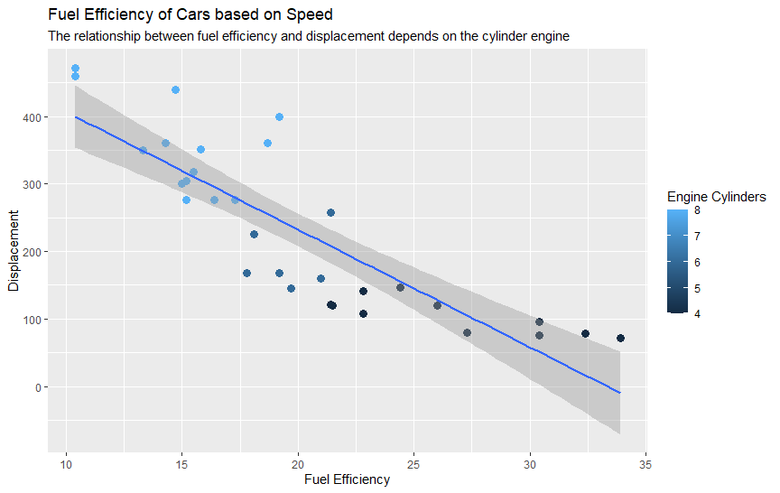
Our graph is already looking better! However, it is still missing that professional appearance that we look for in plots. Some of the reasons this is the case is due to our spacing, font size, and the lack of a unique appearance. Thankfully, we can fix all of these issues with a Theme.
ggplot provides Theme packages which provide you with preset apperances for your graph. On top of this, you are able to modify your visualizations in ggplot on a fine scale using the theme command with no preset. Let’s first look at a way we can add our preset, and then add specific changes beneath.
The common syntax for adding a theme preset is as follows
theme_type()
Let’s add a unique theme to our graph.
ggplot(data = mtcars) +
  geom_point(mapping = aes(x = mpg, y = disp, size = -cyl, color = cyl)) +
  geom_smooth(method = "lm", aes(x = mpg, y = disp)) +
  labs(x = "Fuel Efficiency",
       y = "Displacement",
       Title = "Fuel Efficiency of Cars based on Speed" ,
       subtitle = "The relationship between fuel efficiency and displacement depends on the cylinder engine",
       color = "Engine cylinders") +
       #for our legend, renaming will require us to call the name of the variable which is color
  theme_bw()
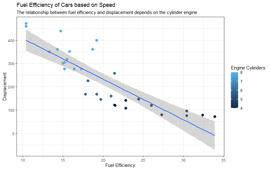
This looks a lot better. For my graph, I want to change 3 more things about it that I will use the theme() command without a preset for.
- I want to make my title, and axis labels bigger and my subtitle smaller
- I want to move my legend to the bottom right corner
- I want to increase the amount of tick marks on the x and y axis. And add space between my axis labels and titles.
Let’s make these changes to our plot
ggplot(data = mtcars) +
  geom_point(mapping = aes(x = mpg, y = disp, size = -cyl, color = cyl)) +
  geom_smooth(method = "lm", aes(x = mpg, y = disp)) +
  labs(x = "Fuel Efficiency",
       y = "Displacement",
       Title = "Fuel Efficiency of Cars based on Speed" ,
       subtitle = "The relationship between fuel efficiency and displacement depends on the cylinder engine",
       color = "Engine cylinders") +
       #for our legend, renaming will require us to call the name of the variable which is color
  theme_bw() +
    scale_y_continuous(breaks = c(0,50,100,150,200,250,300,350,400,450),
                    labels = c(0,50,100,150,200,250,300,350,400,450))+
  theme(
       plot.title = element_text(size = 17),
    plot.subtitle = element_text(size = 9),
    axis.title.x = element_text(size = 12, margin = margin(t = 20)),
    axis.title.y = element_text(size = 12, margin = margin(r = 20)),
    legend.justification = "bottom",
  )
In our case above, I used a new command called scale_x/y_continuous. This is an aesthetic feature that allows us to change the number of ticks in our graph. With these changes, let’s look at our finalized graph.
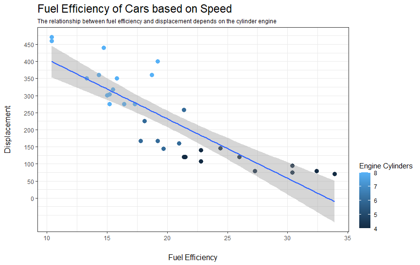
And with that, we have created a visually appealing graph that accurately informs our viewers of what we are looking at. When working for companies and other groups, they may request specific features in the visualizations you make. Because of this, it is important that we have a strong understanding of ggplot to meet their needs.
Next Steps
Now that we have looked at how we can use ggplot to Visualize our data, let’s look at the packages that RStudio offers to Analyze data.